

Designed to sell books!
This article is for people who are planning or considering using the CirclePOS website. The aim is to explain what it is and what it is not. In short CirclePOS is optimised to sell books.
We are going to make an assumption that your primary objective is to sell books and the primary reason customers come to your site is to buy books. The CirclePOS layout is built around this purpose, but more importantly the needs of bricks and mortar bookstores wanting to extend their wonderful instore service to online customers.
Specifically designed for bricks and mortar bookstores
You can think of the CirclePOS website a genuine online store providing all the wonderful services (and then some) you also provide in store.
As well as providing a predictable easy path for customers wanting to buy a book and have it shipped (standard ecommerce) they can also interact with you (and you with them), just like you do in-store.
Through the website customers have the option to reserve books through the "click & collect" feature, just like they once would have by phone. They can inquire about books not currently in stock, and the bookstore can facilitate special orders. Additionally, the bookstore can proactively contact customers when an author or title they're interested in is about to arrive.
Customers can create wishlists and share them with friends and family, and ask you to let them know when something is back in stock.
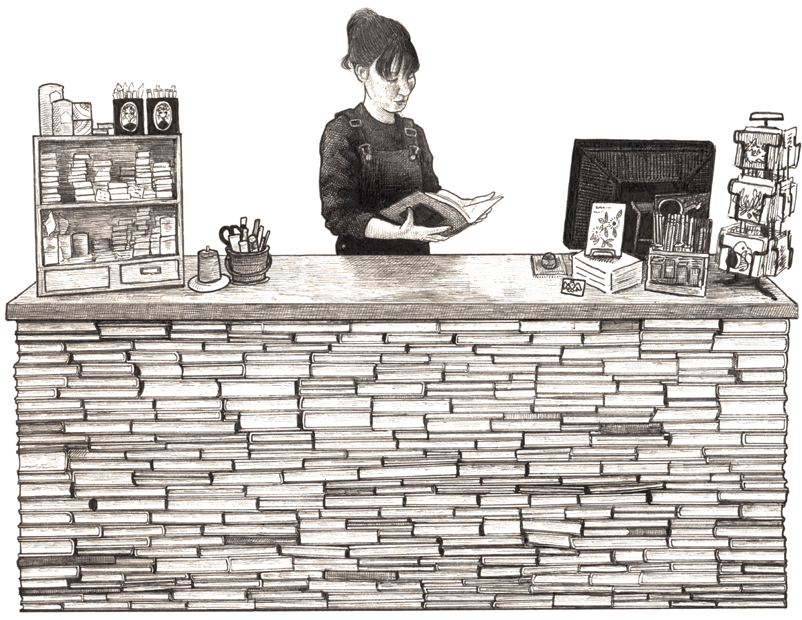
Artist credit for the above image: Lily-Mae Martin
Why the layout is like it is, and what you can change
A simple template crafted for performance
The template includes a series of standard content blocks and while some want something 'different and special,' its current form is the result of what works best. We spent considerable time looking at best practice when it came to designing an eCommerce website.
Adhering to certain standards is crucial: login top right, menu on the left, search top right, and so on. Deviating from these familiar elements can mean people get lost!
While following these essential standards, there's ample room for branding and theming by utilizing standard 'no code' customizations. Upload your logo, choose a font from Google and select colours and background images to make the site your own. For those seeking a more tailored approach, delving into custom CSS opens up many possibilities. Check out the guide for graphic designers for detailed information on how to achieve this.
Stores putting a stamp on the standard template
- thecuratoreum.com
- thekidsbookshop.com.au
- escapehatchbooks.com.au
- shop.marymartinbooks.com.au
- macleansbooks.com.au
- leafbookshop.com.au
- epicbooks.co.nz
- paperbackbooks.com.au
- schrodingersbooks.co.nz
- thelittlebookshop.co.nz
- shop.brunswickbound.com.au
Getting the home page right
Firstly, space and time remain limited
A heat map study we did showed that very few people scroll down the home page, let alone browse through categories, but that search is well used. A highly visible, responsive search is critical.
People leave within seconds if what they want isn't on the first screen. Your homepage's top section, the hero space, must feature what matters most, coupled with a clear call to action. Think of this space as your store's front window. It is there to catch the attention of people walking down the street past your shop.
If your primary goal is to sell books, and people coming to your website are primarily looking for a book, then you better have one (the hottest one you've got), and the ability to buy it on that first screen.
Branding is important, but it should not take half this precious space to tell customers who you are. Keep banners minimal and make sure the search stays within it. Having a book, and potentially the first carousel (and search) in the hero section, tells customers that are looking for a book that they can get one here. And, if the one they want isn't in front of them, they can easily find it by searching. With these basics ticked off customers might give you more time and start to scroll and browse categories.
Home Page vs Landing pages
Optimal traffic flow: beyond the homepage
It is important to realise that not all traffic goes through your homepage, in fact it is ideal that it does not.
Home pages have a limit to what can be put on them, and the majority of your customers will not see what they want there. Similar to your carefully curated shop window, these elements serve as appetizers, designed to catch the eye of wandering visitors unsure of what they seek. The goal is to entice them, inviting them to step into your virtual store and explore further.
People that arrive at your home page will most likely be familiar with your bookshop; searching by shop name or keying the URL (or possibly searching for a bookshop in a particular town). Landing pages on the other hand are 'home pages' for a specific product and have the same hero space and need for a call to action, i.e. you need to see that book on the first screen and a button to get it. Landing pages are perfect for people searching for a specific book, why bother these customers with sending them to your home page and have them search again.
For this reason, every book has its own page. A page with a list of books by a particular author could be another alternative aimed at customers just looking for titles by that author.
Think carefully before covering your CirclePOS web shop with another website
Caution is advised before cloaking your web shop with another site. If the primary objective is not to sell books, or if buying books is a secondary interest for your visitors, then something more informational and freeform might be better for you.
We call these companion sites. Companion sites start to become worth considering when you have large amounts of long form and/or graphic content to deliver; these might include, blogs, videos, author events etc.
The content management system built into the CirclePOS integrated website is easily able to handle reasonable static content; like opening hours, about us pages and images. Social feeds and newsletter sign-up forms can also be added if desired.
Finally, you can have your cake and eat it too... If you feel you need a companion site but primarily want to sell books then we recommend assigning your CirclePOS website as the main domain 'yourdomain.com' and the companion site the subdomain, 'blog.yourdomain.com'.
Search Engine Optimisation
SEO is a whole other topic; you can read more about ranking higher in search engines here.
Broadly speaking, SEO is split into 'onpage optimisation' which we take care of for you, and 'off page optimisation' which mostly boils down to encouraging other sites to link to yours, a task simplified by a user-friendly interface and compelling content.
Concluding note
If you want to sell books and your customers primarily want to buy books, then make sure you place books - and the ability to buy them, front and centre.
Consider incorporating elements like blogs into the navigation, positioned behind the main site. Set them up as dedicated landing pages for those specifically interested in those topics.